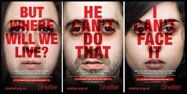
-shocking images
- emotive language and images
-relatiable issue
-recognisable images etc.
Shelter Campaign:
Founded in 1966 in London.
Aims to help people with homelessness and bad housing. Give advice and lobbies government to make changes to improve housing.
Campaign launched in 2011 (ran for 6 weeks from August 21) to encourage people at risk of losing their home to ask for advice earlier.
Main focus of campaign is poster ads, but Facebook and mobile messaging where also used.
The poster campaign initially in four towns identified as hotspots for housing problems.
Campaign was created by Amplify on a pro bono basis.
Purpose:
To campaign
To provide information
Aims:
Raise awareness of homelessness arising in today's society, especially with the recession and current economic climate.
Advert analysis:
Eyes looking at reader and level, creates relations with viewer. level shot shows equality and that homelessness can strike anyone.
Generic codes and conventions of charity ads:
●The
creation of sympathy for the subject of the charity (use of facts and
statistics)
●The
creation of empathy for the subject of the charity ( use of images - how would
you feel if you were in their shoes?)
●Shock
– make you feel that you have to contribute to the charitable cause (disturbing
images)
●Charity
name / logo
●Slogan
●Image
of victim maybe isolated
●Sombre
mode of address
●Use
of colour
●Colour
associated with brand
●Web
address
●Invitation
to interact with company / donate
●Message
will be text / image based

No comments:
Post a Comment